New Personal Website!
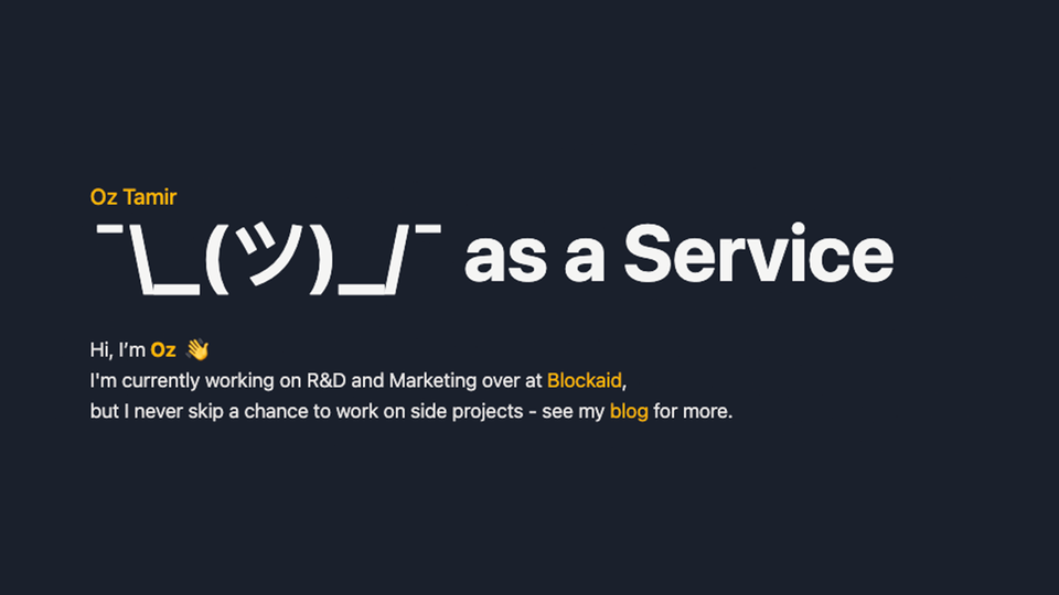
This is how my personal site, over at https://oztamir.com, looked like - until a few minutes ago, at least:
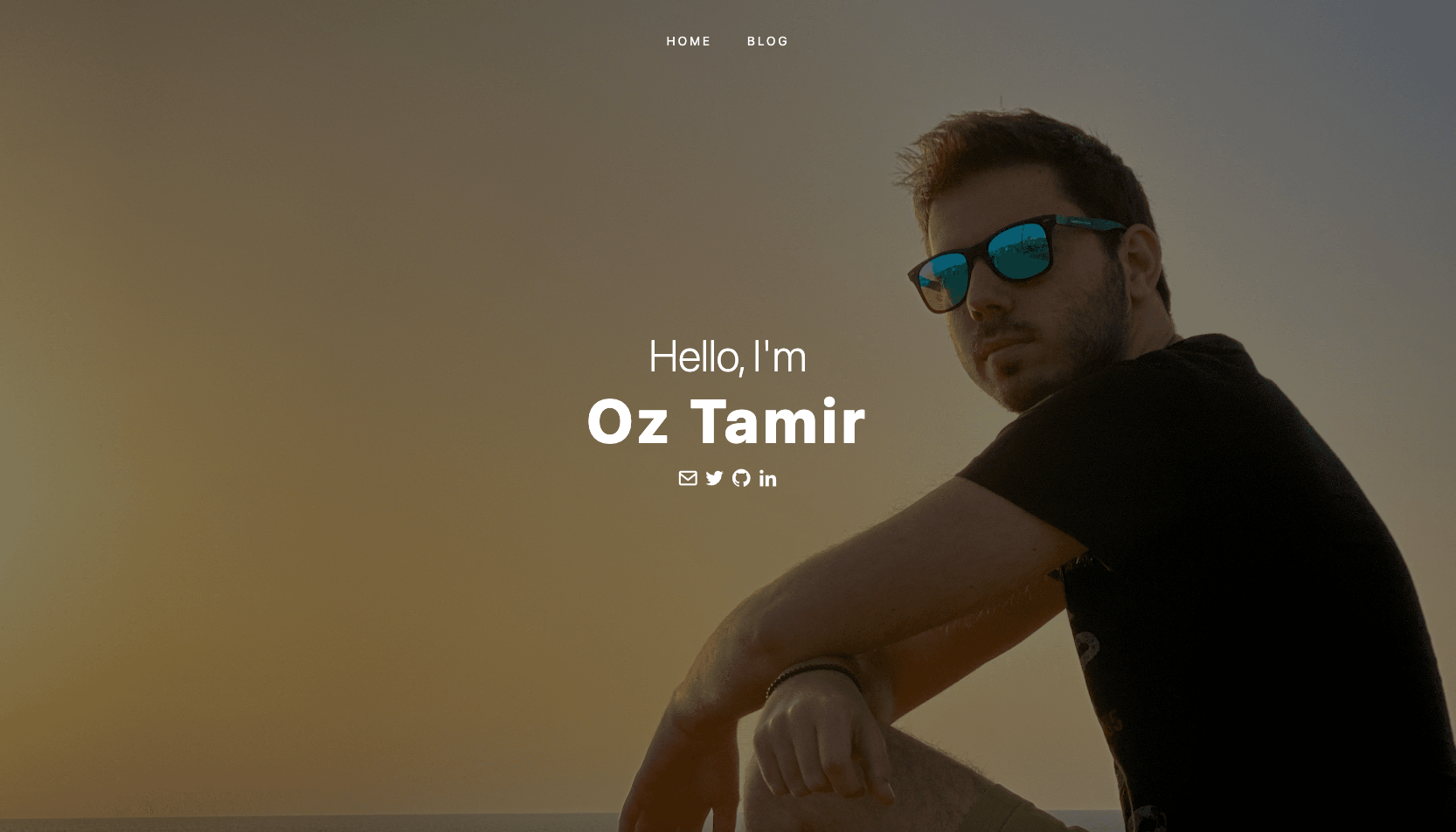
I created this homepage five years ago. I liked it—it was simple, had all the links I needed it to have, and, for some reason, I thought I looked cool in the image.
However, it has recently dawned on me that it is starting to show its age. The worst issue with it, in my opinion, was that it lacked context—I have a lot of good content that I write in this blog, for example, but it’s not showing up on the homepage—why? Another issue I had with it was that it did not provide visitors with useful information about myself.
While I knew these issues existed for some time now, I hadn’t found the time to work on them. I always had other projects that took the front seat—updating the site was just not very important. At least, it wasn’t until recently, when I started working on product marketing at my company (Blockaid).
This experience opened my eyes to the power of a well-crafted, up-to-date brand. And since my personal website is selling the most important brand for me - myself - I decided it was time for a complete overhaul of my personal website.
The new design
This is how my personal website looks now:
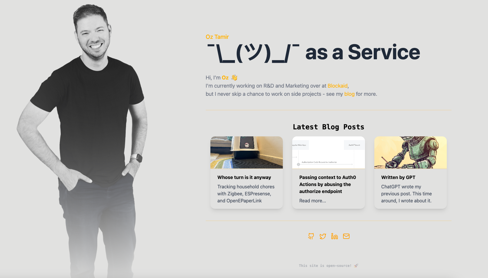
The new design is sleek, modern, and, most importantly, a better representation of who I am today. But beyond the visual refresh, I’ve finally sat down and implemented the features I’ve wanted to implement for years.
Blog Posts Component
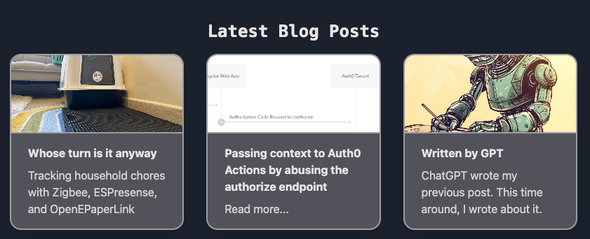
One of the standout additions is integrating Ghost CMS's API to display my latest blog posts. Let's take a closer look at how it works.
For context, the website is a React app written in Typescript, hosted on the fantastic Cloudflare Pages (The free tier is more than enough for a personal site). For styling, I am using the Tailwind CSS library.
The integration with the blog is implemented in a React hook called useLatestPosts (from useLatestPosts.ts). The hook is using the Ghost CMS API to fetch the three most recent posts from my blog:
const useLatestPosts = () => {
  const [posts, setPosts] = useState<Post[]>([]);
  const [loading, setLoading] = useState(true);
  const [error, setError] = useState<string | null>(null);

  useEffect(() => {
    const fetchPosts = async () => {
      try {
        const response = await api.get("/posts", {
          params: {
            limit: 3,
            fields: "id,title,slug,published_at,excerpt,feature_image,url",
          },
        });
        setPosts(response.data.posts);
      } catch (err) {
        setError("Failed to fetch posts");
      } finally {
        setLoading(false);
      }
    };

    fetchPosts();
  }, []);

  return { posts, loading, error };
};
This hook is then used in the BlogPosts component (from BlogPosts.tsx) to render the fetched posts:
const BlogPosts = () => {
  const { posts, loading, error } = useLatestPosts();

  if (loading) {
    return <div className="text-center">Loading...</div>;
  }

  if (error || !posts) {
    return null;
  }

  return (
    <div className="container mx-auto px-4 pb-10 border-b-2 border-b-golden/20 lg:mb-10 mb-4">
      <h2 className="text-2xl font-bold mb-4 text-center dark:text-stone-200">
        <a href="https://posts.oztamir.com">
          <code>Latest Blog Posts</code>
        </a>
      </h2>
      <div className="grid grid-cols-1 md:grid-cols-2 lg:grid-cols-3 gap-8">
        {posts.map((post) => (
          // Post rendering code
        ))}
      </div>
    </div>
  );
};
Another feature I'm happy with is the dark mode support. While styling the HTML to deal with dark mode is quite easy with Tailwind, I found myself facing a problem with the main image - The image cannot be styled with CSS to have a different background when the browser is in dark mode.
To address this issue, I started by creating two images with Photoshop—one is the original image, with a bright background, and another one that has a dark background to match the background color of the site when it’s in dark mode.
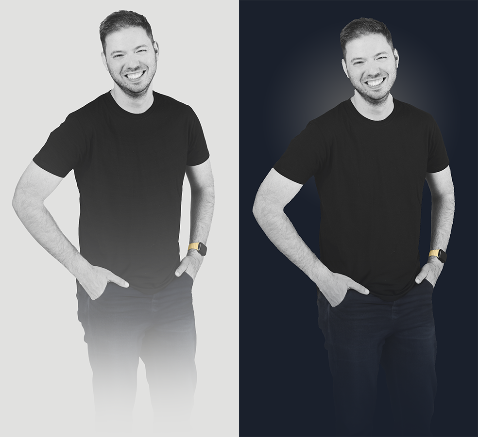
Once I had both images, I used Claude.ai to create a React hook (useDarkMode.ts) that will help me detect when the browser is in dark mode:
const useDarkMode = (): boolean | undefined => {
  const [isDarkMode, setIsDarkMode] = useState<boolean | undefined>(undefined);

  useEffect(() => {
    const mediaQuery = window.matchMedia("(prefers-color-scheme: dark)");

    const handleChange = (e: MediaQueryListEvent) => {
      setIsDarkMode(e.matches);
    };

    // Set initial value
    setIsDarkMode(mediaQuery.matches);

    // Add listener for changes
    mediaQuery.addEventListener("change", handleChange);

    // Clean up
    return () => mediaQuery.removeEventListener("change", handleChange);
  }, []);

  return isDarkMode;
};
This hook is then used in the OzImage component (App.tsx) to display the appropriate image based on the user's color scheme preference:
const OzImage = () => {
  const isDarkMode = useDarkMode();
  if (isDarkMode === undefined) {
    return null;
  }

  return (
    <div className="lg:h-[100svh] h-[50svh] pt-6 lg:pt-0">
      <img
        src={isDarkMode ? "/me_dark.png" : "/me.png"}
        className="h-full lg:pl-10 pl-[4.5rem]"
        alt="Here I'd put an image of me - if the server would allow me!"
      />
    </div>
  );
};
Conclusion
This redesign process has reminded me of the importance of keeping my digital presence current. It's not just about aesthetics; it's about accurately representing who I am and what I do.
Remember, your personal brand is a continuous work in progress - don't be afraid to update and refine it as you grow and change. I'm incredibly pleased with how this project turned out - I think it not only looks great but also incorporates features that make the site more dynamic and user-friendly. I’ve made the code available on GitHub for those interested in the technical details or looking for inspiration for their own projects.
Feel free to contact me and let me know what you think about this redesign - who knows, I might update it again in a couple of years.
FIN
